

How to make your product photos stand out on Instagram and Pinterest
Picture this. You’ve designed the most amazing product, that solves your ideal clients needs. The problem? You’re not doing it justice with your current product shots. Let me help you. Here are the main things you need to be thinking about to make your product photos stand out, on Instagram and Pinterest.
Both platforms are fast-paced, and you need to have knock-out images to stop the scroll. Let’s dive in to how you can make your photos shine online.
Lighting
Lighting is the most fundamental thing you need to get right. There’s lots of fun things you can do with lighting to make your images more interesting. Have a play and see what happens when you let go of perfectionism and get in the creative zone. You could use GOBO’s, gels, create shadows or use refractors in front of the lens to create some cool shots.
If you’re just wanting to get the basics right, have one key light as your main light source, and make sure it’s got a neutral temperature to it. 5500K (Kelvin) is the perfect colour temperature as it emulates natural sunlight. You don’t want anything too warm or too cool that may affect the colour of your product.
Turn off all ambient lights – fluorescent lighting, spotlights, lamps etc and just work with one light that you can control the angle and intensity of. I use the Godox FV150 because it’s a continuous and strobe light all in one. That means it stays on until I turn it off AND will produce a flash of light when paired with a trigger, so I can get more dynamic shots too.
Use whatever you have available, whether it’s a ring light, LED panel or even natural light if you have a big window.
Composition & Framing
A key way to stand out online in a busy digital space, is to make your photos interesting through composition and framing. Your composition is what you include in your scene. All the elements in your photo, make up your composition. Your product, the props, the backdrop, the lighting – everything. A few of the classic compositional techniques include:
Rule of Thirds – You can divide your frame with two horizontal and two vertical lines into nine equal squares. You can play around with placing your product and props along these lines or at the intersections of each grid to create balance in your frame and dynamic compositions. Set up the grid function on your camera to help you frame your shot. iPhone’s have this feature too!
Leading Lines – Leading lines are what they suggest, natural lines that draw your attention from one part of the image to the other, through one or more lines in the frame. You can create leading lines or be led by natural leading lines if shooting out on location. This is a good way to direct the audiences attention to a particular part of the image (aka – your product).
Symmetry – You could use a mirror to create symmetry within an image. Symmetry is often used to create balance within an image and a state of harmony which is visually pleasing.
Framing – Place elements/props around the main product to create a frame, which draws attention to your subject. This can also be done on location, finding things to shoot through or in the studio with the use of props.
Diagonals – Diagonal lines when used correctly, create real depth to an image and can be used to create movement in an otherwise static shot. This type of technique would be good for a product that’s intended use is to move – like a car or motorbike. Of you could use your backdrop to create a diagonal leading line to draw the viewer’s eye through the scene.

Frame within a Frame – Using a window or door with panes can create an interesting composition and really highlight your intended subject. This would be good for food & lifestyle imagery where it’s as if we’re someone peering into a window of a house or out onto the garden.
Rule of Odds – It’s a well known fact in this industry that using an odd number of anything within the frame creates a visually pleasing image. Typical numbers of things would be one, three and five, depending on the size of the product. (1 basketball, 3 lemons, 5 chocolate buttons etc)
Pattern & Repetition – Using patterns and repetition helps make an image memorable. Make sure your products are evenly spaced out for a balanced and cohesive image.

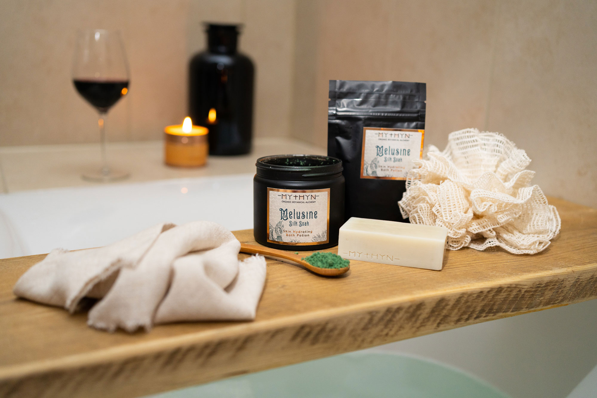
Props
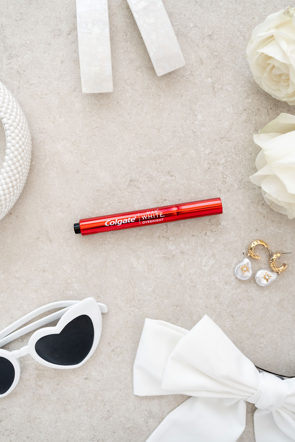
Your props are there to aid the story you’re creating for your audience. You can go one of two ways with props; stick to the brief and collate items that are relevant to your scene, or go wild and find anything and everything to create something striking, wacky and different. You could pick props based on colour, theme, fabric, shapes – the list is endless. I believe less is more, but you should have lots of options to choose from so you can swap things in and out of your frame if you want to change it up.

Colour
To have an image stand out, you want the colours to POP. The main ways to do this is, through lighting, props & backdrop and in the editing stage. Make sure your lights are a neutral colour temperature and that your product is lit evenly from both sides. This will help bring out the authentic colour of your product.

You could experiment with using props and backdrops that are in complimentary colours or analogous (i.e. colours that are opposite in the colour wheel or next to each other). To make the colours pop, putting opposite colours together in an image works really well as does putting similar colours together as long as they’re not too similar to your product as this could get lost.
Editing is also a great way to make colour pop by increasing the contrast, vibrancy, saturation, and playing around with the Hue levels too. My go-to would be to keep them as authentic as possible to not mis-lead your customers but it’s also good to experiment and find your editing style.
Backdrops
Keep your backdrop simple but still relevant to your scene. If you want to create a bathroom scene, use a tile backdrop. If you want something fun, add in a coloured tiled backdrop. Keep it on-brand but remember, we want the product to be the focus. We don’t want to distract the audience with lots of different things to look at in the scene because that’s when the messaging is diluted, and they continue scrolling.

Depth
Try to create depth in your images to create interest. Give your product space to breathe if you’re creating a scene with props and creative lighting. Again, the product you’re selling needs to be the focus. So you can have the foreground and background out of focus by creating space in the scene and using a camera that allows you to control the aperture. (How blurry or in-focus an image is).
Miscellaneous
Get creative, have a play. Use different materials in your work. Do you want to create a swatch shot with your product? Or a drip shot? To show the viscosity of the liquid? What about submerging your product in water or a milk bath? How about using natural elements like soil, sand, leaves, seaweed?
The possibilities of making an interesting image are endless. My best piece of advice? Get out there and have fun. Don’t overthink it. Start doing. Have a loose plan and see where you end up. You never know what ideas might come to you once you get in the creative zone.
Those are my top tips on how to make your product photos stand out on Instagram and Pinterest.
Still need help?
If you’re fed up with DIY-ing your content and want to enlist the help of a professional, let’s chat. I offer free, no-strings-attached calls so we can discuss your requirements and see if we’re a good fit for one another.
To see more of my product photography work, check out the gallery. For more tips & tricks, case studies and educational content, feel free to roam the blog a while. To take a peek behind-the-scenes and listen to my daily rambling, here’s my Instagram handle. I’m also on LinkedIn so be sure to connect with me on there too.
Catch you in the next post.